The story of Blitzkrieg
Why start with a monster…?
Well we decided back in 2009 to follow the path of least resistance, and as more research had been done on the early part of the war, we were able to get the game towards release within a reasonable period of time. Clearly the bigger the time frame and area covered the longer research takes. Blitzkrieg being our first game also had to make a bit of a splash – which it duly did getting credibility for TKC and DE Ltd. whilst selling out over time.
Why the Box lid design…?
This was a conscious decision and was a part of the conceptual art element of how TSWW is tied together as a game system. Firstly I looked at period mapping, colours, design content, fonts and so on to work out what would have been a typical piece of art.

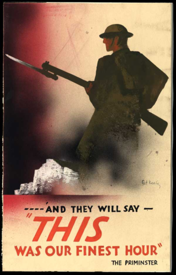
Propaganda posters similar to the ones attached were a major inspiration as was the typically sans serif style fonts of the period. The games use a specific font which is very similar to that used in WW2 by the British Government for all of its posters and many communications. It is conveniently very similar (but subtly different) to that used on the London Underground… and that got me thinking about the box art.
Should it follow the more typical American companies with lots of pretty well drawn, boldly coloured elements on the box, or should it be a bit different? I felt and still do feel that my decision to be different and to use some very strong but unusual images in the game was correct.
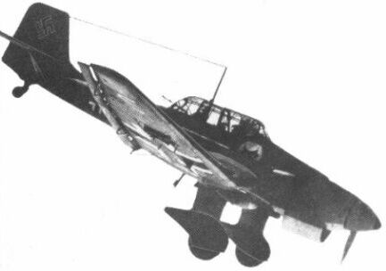
Most people doing this plump for something like a Ju87 dive bomber (many great images out there) or a dog fight from the Battle of Britain or maybe the Dunkirk evacuation. None of those things in my view have the drama of the night raids on London and the UK undertaken by the Luftwaffe, and none come close to the vital nature of what was “the Blitz” to people in the UK who survived the experience.
The Blitz Spirit is looked back upon with awe and pride, and is to this day the benchmark for my countrymen and their reaction to adversity. The game art therefore started in my mind to be some image of the Blitz, preferably one with major impact.

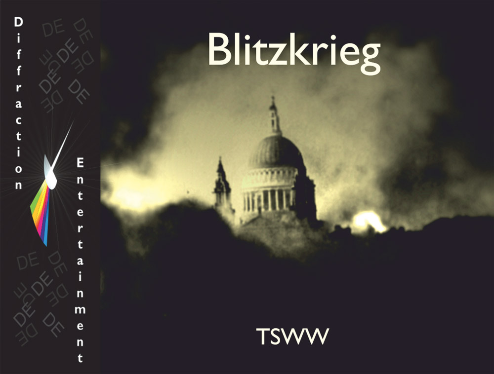
After digging for hours I found a DRM free but poor quality copy of the very famous night picture of St Pauls Cathedral during a particularly severe night attack on London in the Autumn of 1940. This image, despite its poor quality was then worked on, first examining and amending flaws in the file, and then layering it multiple times with a variety of screens, effects, traces, and colorations to slowly get the image you see on the game box.
Iconic it was before my work, but after it, in my view, the impact is nothing less than stunning in the flesh. Visible over 100m away in massive US convention halls, the art draws people to discover what it is about, and then gets them excited about the massive game on the table beside it. Business aside, its deep black and washed out yellows imply the depths of a blacked out night illuminated by the hellish glare of gun fire and bombs exploding as the city burned about the Cathedral.
The back…
Part of the art for all TSWW games with a back cover is the fact that multiple images of the campaigns are “quilted” across the back of the box, before being all but entirely obscured by a transparent “wash” of the primary box front colour, dark enough to permit the signature cream text to be clear against it, but just light enough for the determined to see what is there.
We have from time to time run competitions to discover whether our clients know what is there – usually the results are “no”… so watch out for something in the future of that regard.


0 Comments